Travel App Grid Design
UI/UX Design · Typography & Layout
Research
This project was rooted in exploring the importance of modular grids in typography and digital design. The aim was to understand how type hierarchy, spatial rhythm, and alignment can shape user experience without relying on decorative elements. Inspiration came from minimalist travel apps and editorial grid systems, where structure drives both clarity and aesthetics.
Process
Typographic Exploration
- Designed a modular grid to test multiple variations of text hierarchy.
- Worked with different weights and sizes while keeping flush-left alignment as a rule.
- Focused on building hierarchy purely through space, scale, and balance.
Application to UI Design
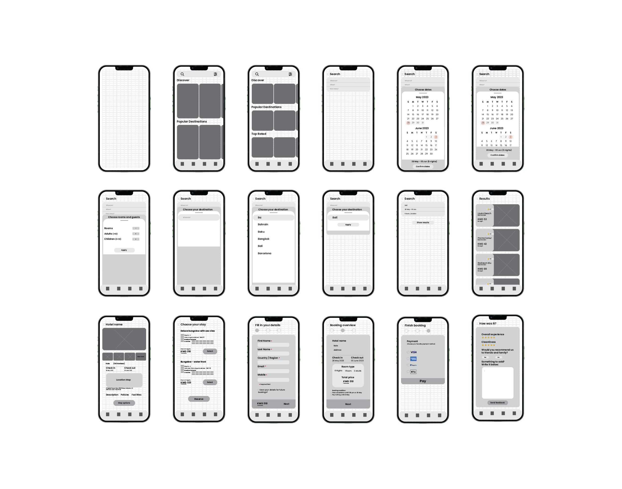
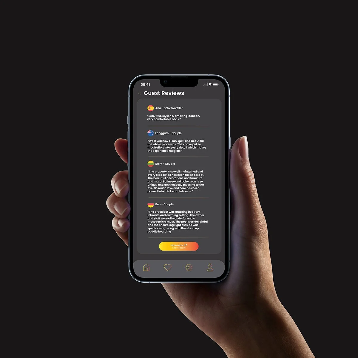
Using the grid system, I developed layouts for a travel application, incorporating both text and images.Key Screens:
- Landing Page – a clean entry point with intuitive navigation.
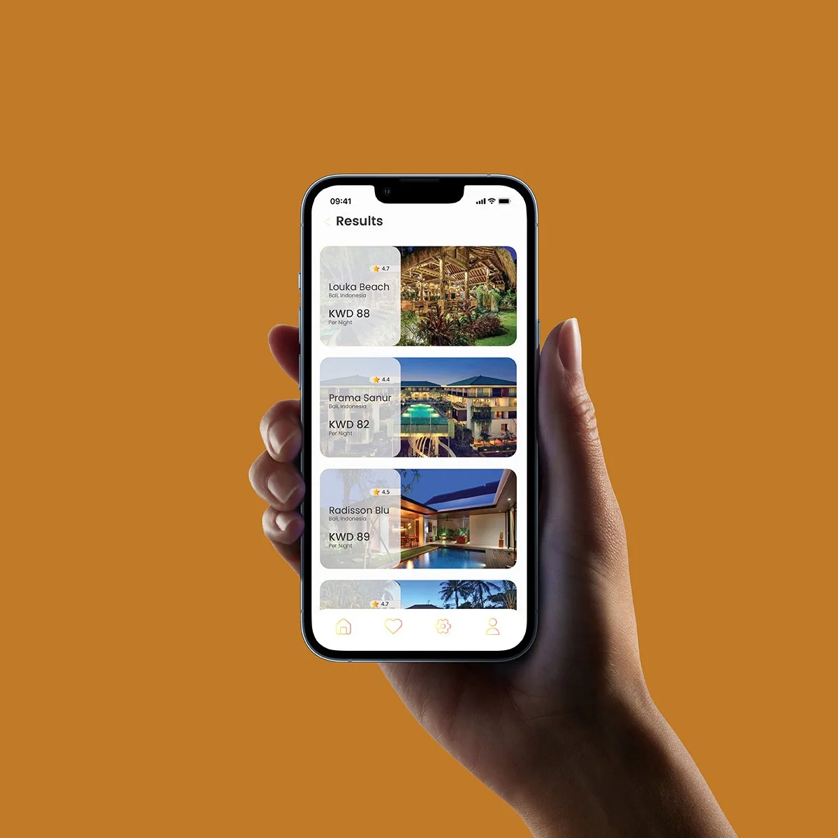
- Destinations Display – modular grid showcasing multiple locations.
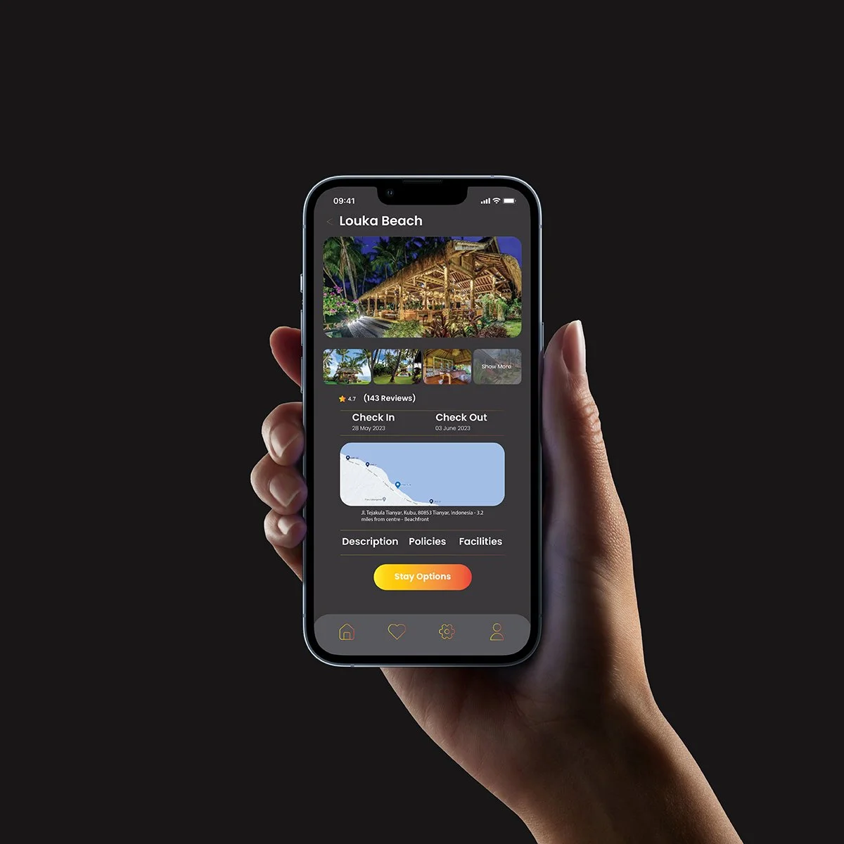
- Destination Detail Page – layout combining descriptive text with images.
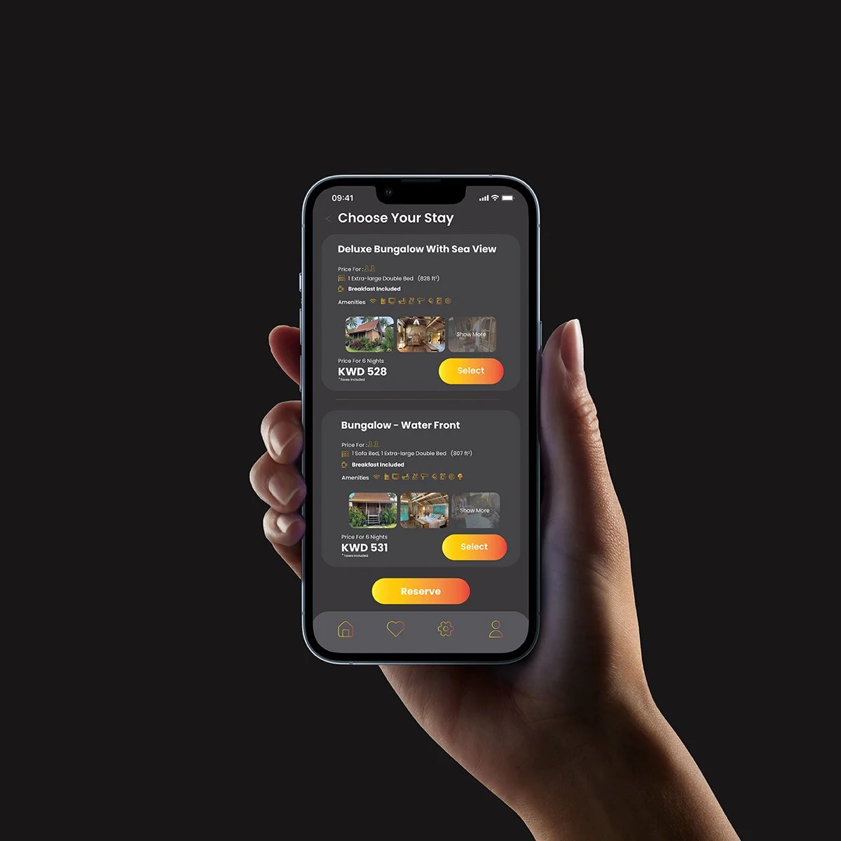
- Booking Form – structured interface ensuring ease of use.
- Feedback Form – minimal, accessible layout encouraging user interaction.
Refinement
- Adjusted grids for readability across screen sizes.
- Established consistent typographic hierarchy with a restrained palette of type weights and sizes.
- Balanced white space to maintain clarity and focus on content.
Outcome
The final design system demonstrates how a grid-based typographic approach can translate into a functional and visually cohesive user interface. By emphasizing hierarchy, alignment, and modularity, the app achieves:
Clear navigation and content organization.
Consistency across different screens and functions.
A minimalist aesthetic that enhances usability and keeps the focus on destinations.
The result is a structured yet flexible design system that bridges editorial grid principles with modern UI/UX design.